Interface

Grouping fields

Grouping fields in cards for convenience

Features

Grouping fields
Collapsible blocks
Visual highlight
Improved readability

Installation and setup guide

Detailed guide for working with widget "Grouping fields"

Widget setup

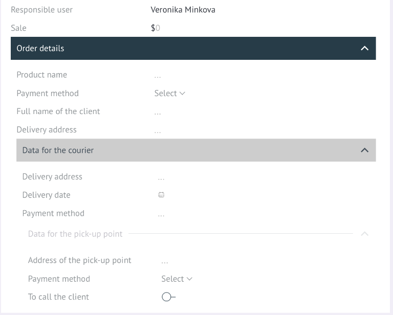
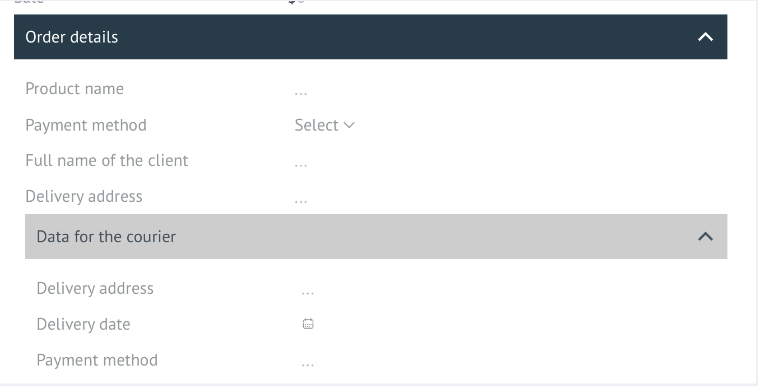
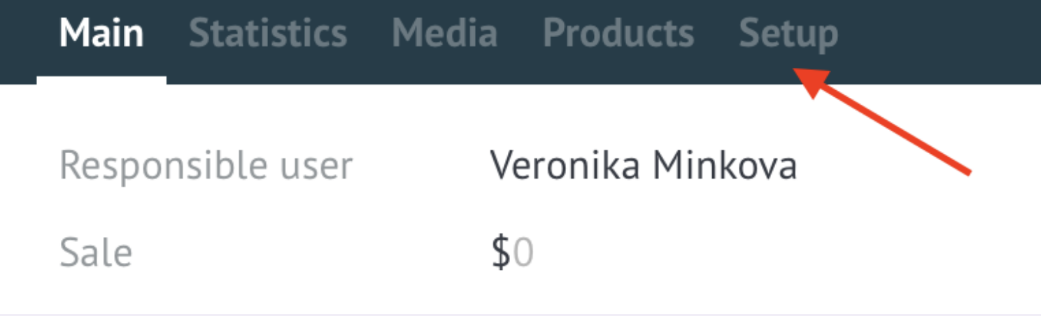
To configure the widget, you need to go to the lead settings

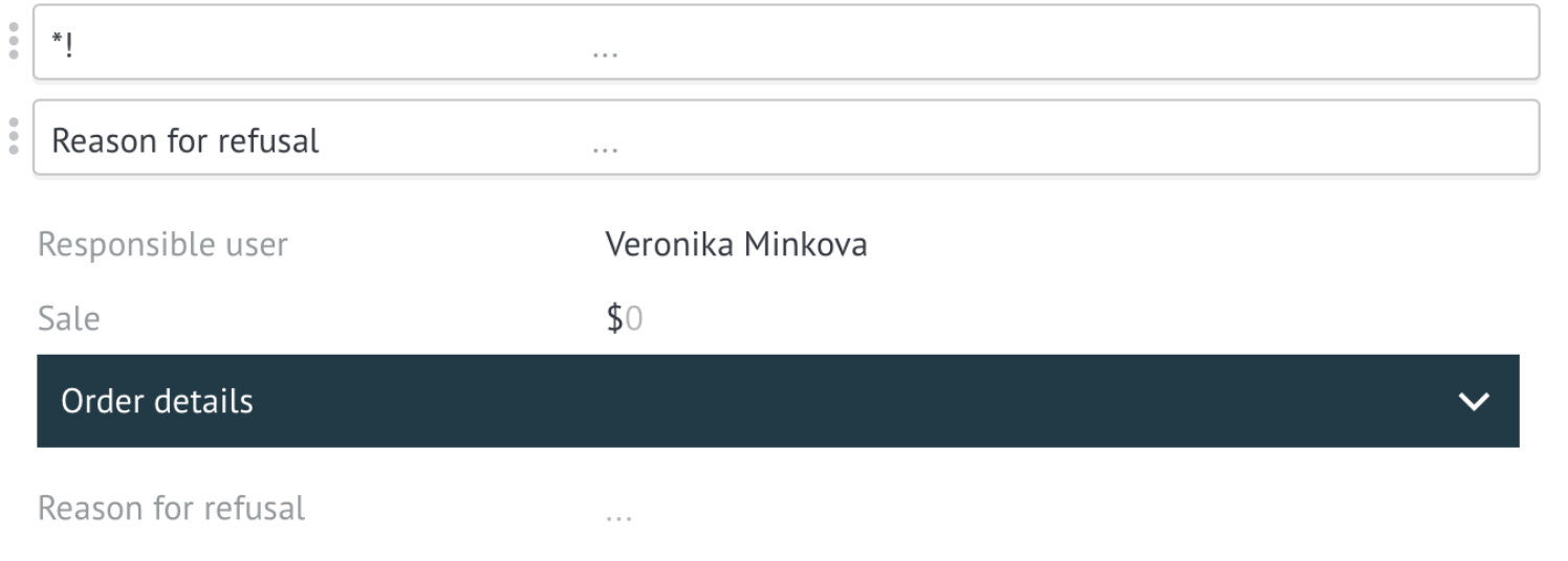
In order to create a group, you need to add two asterisks * to the field name at the beginning and at the end of the name. For example: *Order data*

this field will be the name of the group, all fields that follow it will be included in the group.

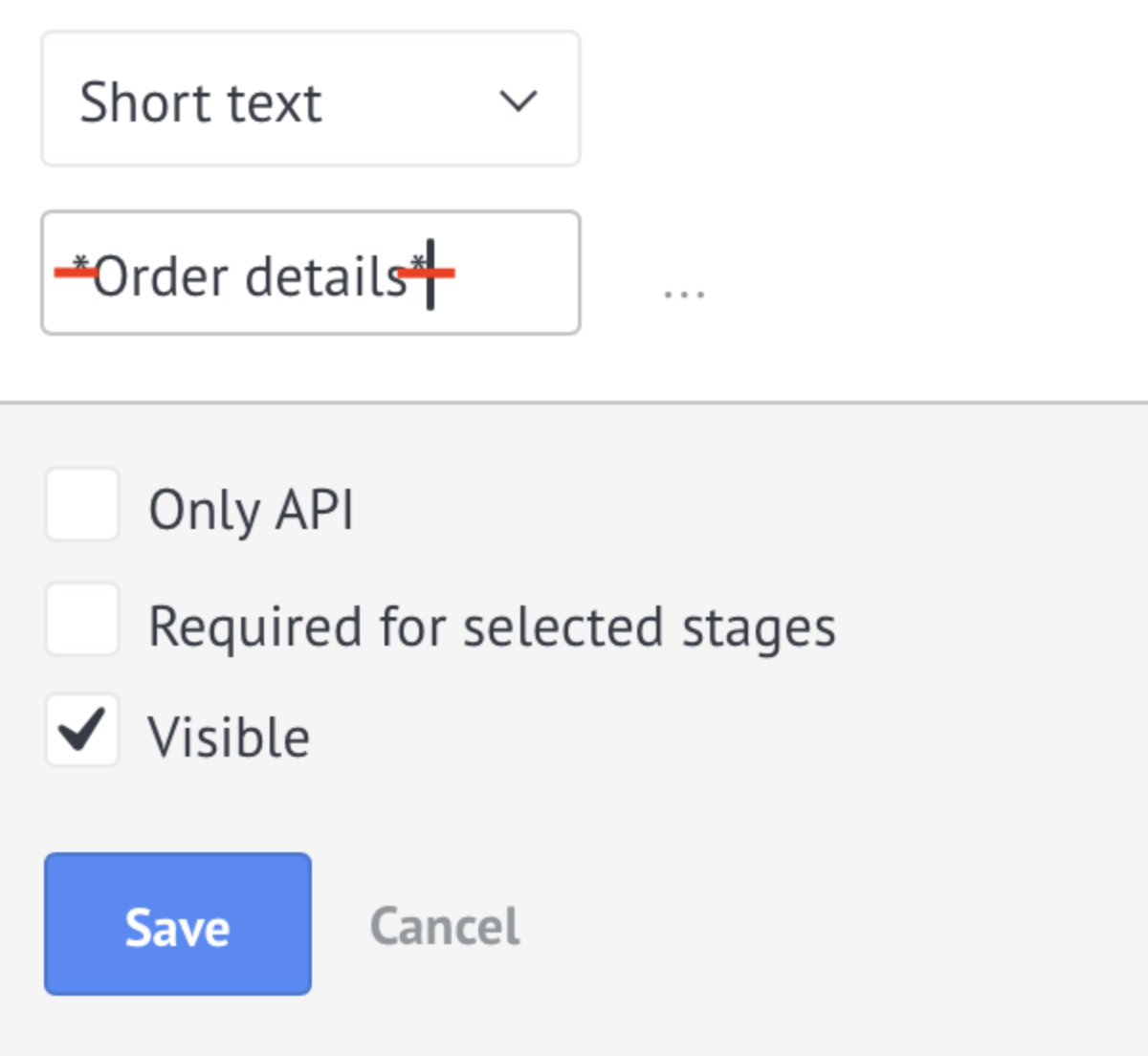
This field will be the name of the group, all fields that follow it will be included in the group.

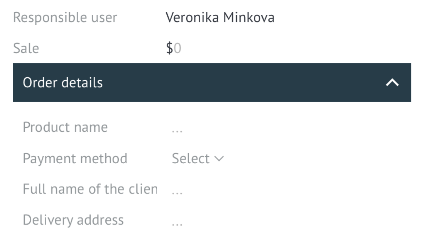
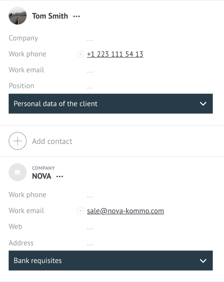
Groups can also be done in contacts and companies

Grouping fields into 3 levels

To create the second and third levels, you need to add hash symbol to the field name #

Two ## for the second level. For example ##Data for courier
Three ### for the third level. For example ###Data for the point of issue

Default public field groups

Add the ability to open groups of fields by default using the circumflex symbol ^

##^Group name - by default an open grouping of the 2nd level
###^Subgroup name - by default an open grouping 3rd level.

Close field grouping

In order to close a grouping of fields, you need to add the field:
*! asterisk, exclamation mark - to close the first level

To close the second and third levels you need to add ##!, ###! accordingly

Setting the group header color

For each created group, you can set the color of its name (header).

What to use:

  • visually distinguish between different types of groups;
  • emphasize the priority or status of the group;
  • adapt the interface to corporate stylistic standards.

Supported values ​​are HEX codes (#RRGGBB)

To configure, you need to go to setting up fields in the lead

Add HEX code to the section title

⚠️The code must be indicated in ** for multi-level grouping, for example *Section#e3f17c* or after the name, for example #Section#e3f17c

In a lead it looks like this:

Show filled fields

The function allows you to control the display of filled fields in the closed (collapsed) state of the interface. When activated, fields containing data will be displayed in a lead, even when the form or block is collapsed.

To activate, you need to go to the widget settings and enable the checkbox Show filled fields and Save

In the interface it will be displayed like this: